DOZE
A friendly guide to a better sleep
Overview ||
Doze is a senior thesis project to complete my BFA in Digital Design. The overall goal of the project was to rethink the way that design can be used to assist those suffering from sleep loss and how can readily available technology be utilized to create an app.
Time Line || January 25th - April 29th 2019
“How might UX design processes be used to help college students establish a proper and healthy bedtime routine?”

The Problem ||
Sleep plays a major part in aiding our bodies on both a mental and physical level. Assisting in retaining memory and helping our bodies rebuild itself over night.
The Market ||
Through the research gathered from user surveys and general interviews. A persona aimed at college students ages 18 - 28 was created.
Design Process || Sketching and Understanding
The app creation was guided through Jake Knapps’ design sprint. Utilizing his five day sprint, and expanding the sprint into a five week process. The sprint began with making a map and finding a target, and later sketching out possible solutions. Next was deciding the best solution with fellow designers and then finally building a prototype and testing it with the target market.
Phases of the Design Sprint :Information Architecture
User Flow-Chart
Sketches
Wire-Framing
First Iteration


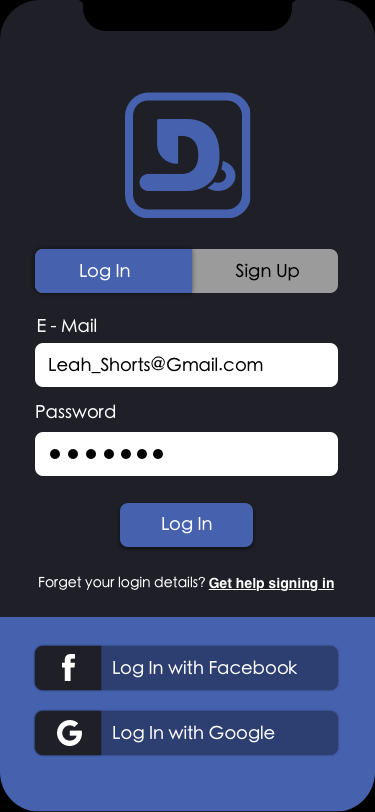
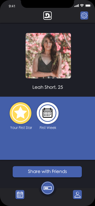
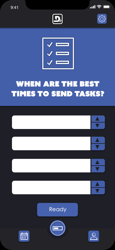
First Iteration || Making the App in Black and White
Developing the first prototype in black and white allows the app to be tested without color judgment interfering with the apps usability. The goal is to create an app that is simple and user friendly.
Understanding the areas of frustration and allowing the app to speak for itself through its overall functionality.


User Testing || Understanding User Needs and Concerns
In the user testing process the goal was to understand the areas of frustration for the user. This allowed the user to explore the app as a new user and a returning user, all while gaining insight on how to make the overall user experience better
5 minute app trials to gain the initial response from the user experience
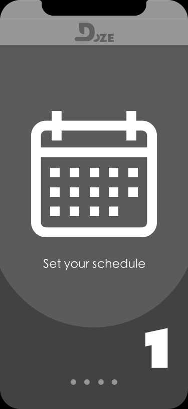
User Test Results : After, running through three user tests to understand points of confusion, there seemed to be a trend when using the prototype. With the main issue, which was understanding how to get the app started. To clear up this confusion, the addition of a step by step user guide was implemented to navigate the user through the app.
Second Iteration App Design || Making Necessary Changes
After user testing the second iteration is created to fix any points of confusion for the user. This also includes the addition of adding color to the app, creating the identity and fixing the functionality of the app.
Fixing the problems from the first iteration of the app
Allowing the user a more simple user experience